

After the fire, before the rain — a prototype data package for post-fire response
On January 7, 2025, the Eaton Fire ignited above Altadena on the outskirts of Los Angeles and ran up the San Gabriel front, burning roughly 14,200 acres of steep slopes that drain straight down into Altadena, Pasadena, and Sierra Madre neighborhoods below.
The flames were the emergency everyone watched. Even then, another threat was already taking shape: what would happen when rain reached the burned, exposed hillslopes?
Wildfires strip away the vegetation and ground cover that anchor soil, so burned slopes shed dramatically more soil once the rains arrive. On the Eaton burn, that soil drains straight into communities already devastated by the fire, where it can pollute water, fill debris basins, and damage infrastructure, further straining recovery. There is little time to get ahead of it: between containment and the first major storm, responders must quickly understand where the landscape has changed and what that change could mean downstream.
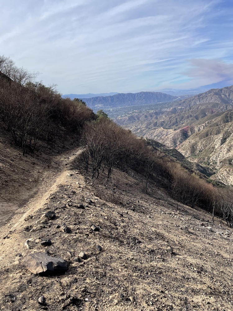
Burned vegetation in the foreground contrasts with partially burned and unburned hillslopes beyond the Eaton Fire perimeter. Photo: U.S. Geological Survey Landslide Hazards Program.
Post-fire response is therefore both a field effort and an information challenge. Federal, state, local, and other partners may enter the response through different authorities, but they often need to work from the same rapidly evolving picture of burn conditions and downstream risk. Technical findings have to move quickly between analysts, field crews, decision-makers, reports, and coordination meetings.
In the first days, that information work becomes intensely practical: teams map how severely the soil burned and begin identifying what a wet season could put at risk downstream. The soil burn severity map becomes a shared starting point for later assessments, including the erosion estimate at the center of this story. All of that competes for scarce time as teams make field judgments, coordinate across agencies, prepare and translate data, and develop funding requests.
To test whether event-specific science could be packaged for that narrow window, Vibrant Planet's science team developed a method to model first-year erosion rates across an entire burn. Applied to the Eaton Fire, it became the basis of a proof-of-concept data package: documented data layers, maps, summaries, and a prototype viewer. Eaton serves as the working example for a larger question: can post-disaster science be translated into reusable packages that response partners and communities can readily use after future events?
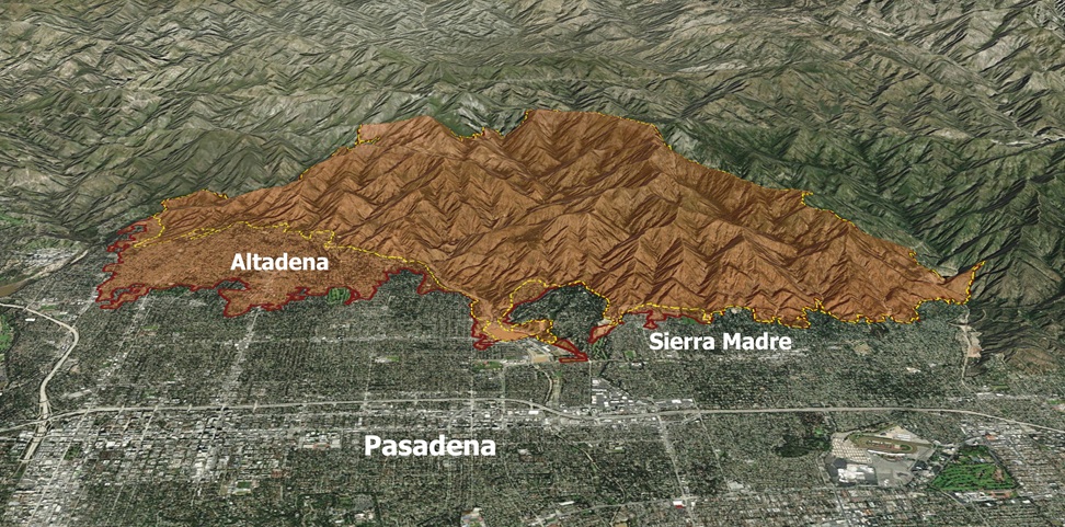
Eaton Burn footprint on the San Gabriel front. The January 2025 Eaton Fire perimeter (red) sits on the steep slopes directly above Altadena, Pasadena, and Sierra Madre — the communities below the burned hillsides. The area analyzed in this study (yellow) covers the portion of the burn assessed for post-fire erosion. Oblique aerial view looking north across the range. Eaton Fire perimeter: USGS PWFDF, Eaton Fire v1.0, 2025. Map by VPDC.
This first package tests that larger idea through one time-critical question: where are first-year erosion rates expected to increase, and how might that information help responders focus field verification and planning? Instead of relying only on generic severity-to-erosion values, the method learns that relationship from observed changes across recent Southern California fires, then applies it to Eaton.
What the Erosion Layer Measures
For post-fire teams, the useful question is not simply how severely the ground burned, but where that change is likely to translate into increased soil loss once rain arrives.
The erosion layer maps where soil loss is expected to increase in the first year after a burn, reported as tons per acre per year. It translates the loss of protective ground cover described above into a spatial estimate of how strongly erosion rates may change across the burned landscape. The infographic below shows that shift and the main components of the layer.
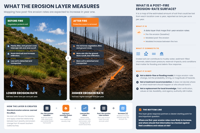
That eroded soil is the start of a chain, not the end of it. Once it's on the move, it can muddy water, fill channels and debris basins, strain reservoirs, and feed the conditions behind flooding and debris flows.
This layer maps the first link in a post-fire hazard chain: the hillslope source, or where burned ground is expected to shed more soil. USGS post-fire debris-flow modeling for Eaton addresses a different link, estimating the potential for acute debris-flow failures. Together, the products describe different parts of the same post-fire process: one characterizes erosion generation across burned slopes; the other evaluates a downstream hazard that erosion can help feed.
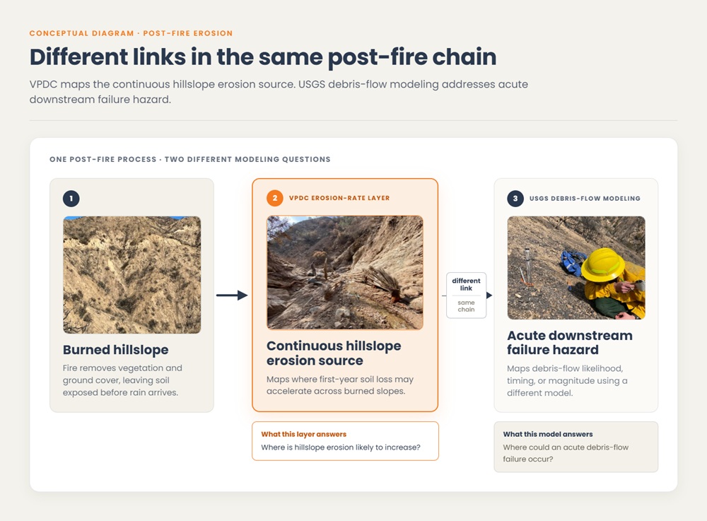
Two questions from one post-fire process: where is hillslope erosion likely to increase, and where could an acute debris-flow failure occur? The first is this layer's job; the second belongs to USGS. Visual infographic created by VPDC
The layer therefore provides a starting point for three practical questions: where are modeled first-year erosion rates highest, where did they increase most after the fire, and where might those signals deserve closer field or planning review?
The Eaton layer is not derived from Eaton alone. It combines the soil burn severity map produced through the post-fire assessment process with a fire-to-erosion relationship learned from observed changes across 16 recent Southern California fires. Applied to a pre-fire erosion baseline, that relationship produces three first-year surfaces: pre-fire erosion, modeled post-fire erosion, and the increase between them.
The soil-loss framework itself is established science; what is new here is how the effect of fire is learned. That is where the method turns next.
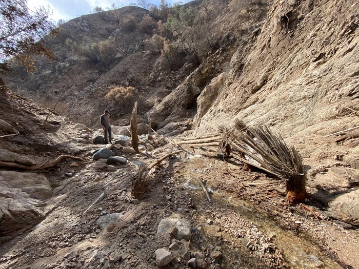
Postfire debris-flow deposit in Rubio Canyon within the Eaton Fire burn area, February 18, 2025. Photo: U.S. Geological Survey, Landslide Hazards Program. Public domain.
What is soil burn severity? After a wildfire, Burned Area Emergency Response (BAER) teams assess how strongly fire altered soil and ground conditions. Satellite-derived BARC data support that assessment, which is refined into a Soil Burn Severity map used in post-fire planning. In this workflow, that severity map is one of the core inputs used to estimate how erosion rates may change after the burn.
How the Erosion Layer Is Produced
So how is that fire effect actually learned? The standard way to put a number on post-fire erosion is to reach for generic coefficients: a lookup table that assigns a fixed erosion factor to each burn severity class, the same value for that severity wherever the fire happened to burn. The method here takes a more direct route. Rather than usin a generic value, it looks to similar nearby fires to ask: how much did erosion potential change inside the burn, compared with what would likely have happened there if it hadn't?
Answering that takes two steps: learn the fire effect from past fires, then apply it to Eaton.
Part 1 · Learning the fire effect from past fires
The method starts from two standard inputs: a soil burn severity map, such as the one BAER teams produce, and a pre-fire erosion-rate estimate. That baseline comes from RUSLE, the Revised Universal Soil Loss Equation, a long-standing framework for estimating average annual soil loss from rainfall and runoff.
What is RUSLE? RUSLE, the Revised Universal Soil Loss Equation, is a standard framework for estimating average annual soil loss from rainfall and runoff. In this workflow, it provides the pre-fire baseline: an estimate of how much soil the landscape was already expected to lose before the burn. The fire effect is then applied to that baseline. RUSLE does not predict soil loss from a single storm, debris-flow timing, or how much sediment reaches a specific channel, reservoir, or intake.
To learn how fire changes erosion, the method looks across 16 recent Southern California fires (2020–2024). For each one, it compares the change in bare ground inside the burn against matched reference areas nearby, places that didn't burn but started from similar conditions. This is a Difference-in-Differences approach, adapted from Yackulic et al. (2025): rather than assume the burned ground would have stayed unchanged, it measures burned and unburned change side by side, through time, and reads the fire's effect as the difference between them.
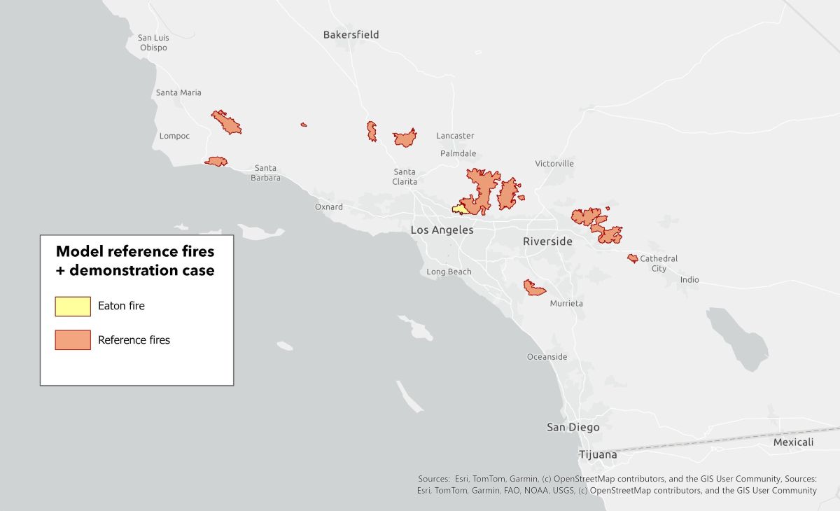
Reference fires and Eaton demonstration case. Sixteen recent Southern California fires were used to learn the fire-to-erosion relationship; the 2025 Eaton Fire is shown separately as the demonstration case where that relationship was applied. Map by VPDC.
That bare-ground change is then converted into a change in the RUSLE C-factor, the term that captures how ground cover affects soil loss. It's worth being exact about what this does and doesn't see: the method never directly observes tons of soil leaving a hillslope. It observes how fire changed ground cover, converts that into a C-factor change, and expresses the result as an erosion-rate multiplier for each soil burn severity class:
post-fire erosion rate ÷ pre-fire erosion rate = severity-class multiplier
Finally, the units are tons per acre per year, and we define change as the post-fire erosion rate minus pre-fire erosion rate.
Part 2 · Applying it to Eaton
With the multipliers learned, applying them is mechanical: Eaton's soil burn severity map is reclassified into those multiplier values, which are then multiplied through the pre-fire erosion surface. The result is a wall-to-wall modeled first-year post-fire erosion surface, plus a change layer: modeled post-fire erosion minus pre-fire.
The mean multipliers used in the Eaton output are:
How to read these numbers
Each multiplier is a learned ratio of post-fire to pre-fire erosion rate, summarized by soil burn severity class. It tells us how much the modeled erosion rate changes, on average, for ground that burned at a given severity class.
Because these are ratios, they should be read alongside absolute erosion-rate values. A large multiplier over a very low pre-fire erosion rate may still represent a modest amount of soil. A smaller multiplier over a high pre-fire erosion rate may represent a larger absolute increase. That is why the data package includes pre-fire erosion, modeled post-fire erosion, and the modeled change between the two.
Where the mean and median differ — as in Class 4 — a few high-erosion areas pull the average up, so the median reflects the more typical case.
One point to state plainly: Eaton wasn't part of the data the model learned from, and because the post-fire record for it wasn't available when the analysis was run, we couldn't measure the model's performance against it either.
What those surfaces reveal across the Eaton burn is where the story turns next.
What the Eaton Model Shows
Applied across the Eaton burn, the outputs tell a story a severity map alone can't, and it starts with where the fire didn't burn hottest. Most of the modeled Eaton footprint did not burn at the highest severity: of the roughly 11,400 acres where every input and output layer carries valid data, about three-quarters is moderate severity and only 4% high. The picture is not a scatter of high-severity hot spots on an otherwise quiet slope — it is a broad, continuous band of moderate burn across the steep San Gabriel front, above Altadena, Pasadena, and Sierra Madre.
Across that footprint, annualized soil loss rises from roughly 10,100 tons per year before the fire to 28,800 after it. The modeled post-fire total is about 2.85 times the pre-fire total, an increase of approximately 185%. These are modeled hillslope soil-loss estimates over the common footprint, not observed sediment, and not a measure of how much material reaches channels, reservoirs, or water intakes.
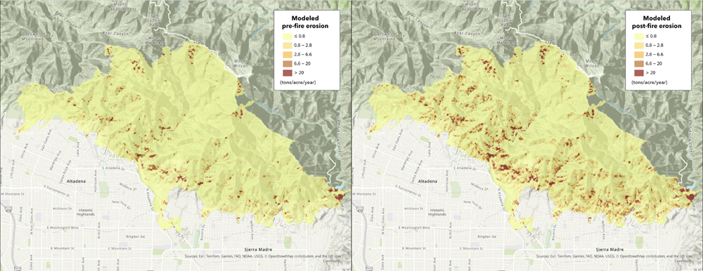
Modeled hillslope soil loss, pre- vs. post-fire, on one shared scale. Post-fire rates are markedly higher across the burn. VPDC pre and post-fire erosion models. Maps by VPDC.
The firewide total, though, hides the more useful finding: where the modeled increase is concentrated.
Finding 1 : The fire amplified an already uneven landscape — it didn't create a new one.
To be clear, the erosion surface isn't the severity map in new colors. It combines each severity class's learned multiplier with the erosion potential already present before the fire, and those two ingredients aren't equal partners. The multiplier ranges only about 1.4× to 9.9× across severity classes, while the pre-fire baseline varies across orders of magnitude, from gentle ground to the steepest slopes. So what the post-fire surface mostly shows is the existing erosion landscape scaled up by fire — not a new pattern the fire invented.
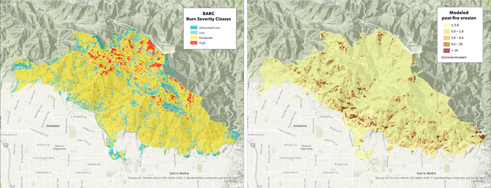
Soil burn severity (left) and modeled post-fire erosion (right), across the same burn footprint — the fire amplified an already-uneven erosion landscape rather than creating a new pattern of its own. Severity: USFS BARC method. Erosion: VPDC post-fire erosion model. Maps by VPDC.
Finding 2: The biggest multiplier isn't the biggest contributor— moderate ground carries two-thirds
High-severity ground carries the strongest learned multiplier, approximately 9.9 times the pre-fire rate. But it covers only about 4 percent of the modeled footprint and accounts for roughly 1 percent of the modeled increase.
Moderate-severity ground has a smaller multiplier, about 4 times the pre-fire rate, but covers nearly three-quarters of the footprint and accounts for roughly two-thirds of the modeled increase.
A severity ranking, in other words, is not a priority map. That’s where the modeled loss comes in.
Post/pre multiplier and share of modeled increase, by severity class
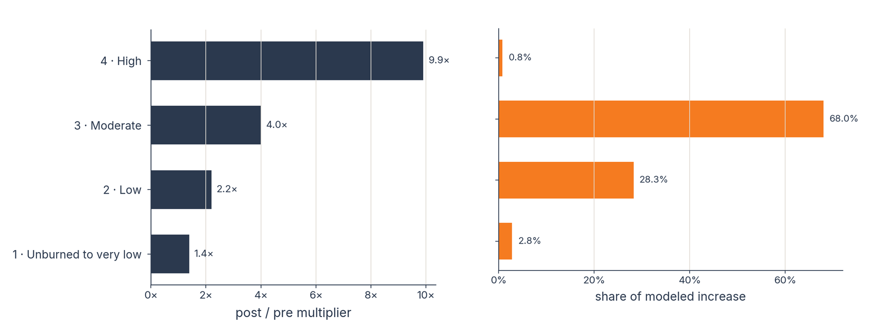
Two horizontal bar charts compare erosion multipliers and share of modeled increase by soil burn severity. The post/pre multiplier for each soil burn severity class, compared with that class’s share of the modeled increase. High severity has the largest multiplier at 9.9× but contributes about 1% of the increase; moderate severity has a 4.0× multiplier and contributes about 68%. Chart by VPDC.
Finding 3: Half the modeled loss sits on 1% of the burn, and response basins show where
Modeled soil loss is steeply concentrated. The top 1% of the footprint, about 114 acres, holds roughly half the modeled soil loss, and almost none of it is high-severity ground. The chart below shows the same pattern across the full footprint: a small share of the burn accounts for most modeled post-fire soil loss.
That concentration echoes Finding 1: the fire heightened a pattern the terrain already held. The highest-rate slopes are also where the model is least certain, so the layer is best used to narrow a large burn to a short list of candidate areas for closer review, not to rank priorities on its own.
Concentration of modeled post-fire soil loss
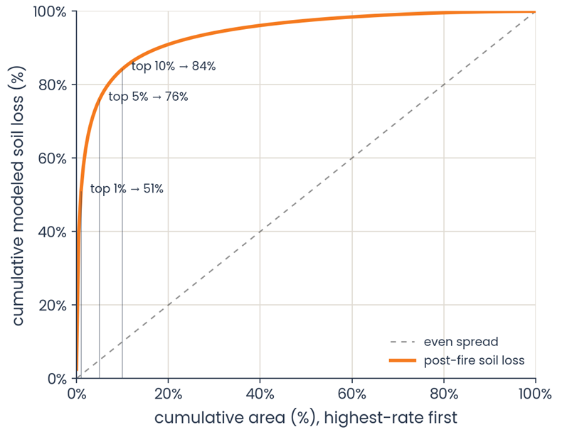
Cumulative modeled post-fire soil loss by cumulative area, ranked from the highest modeled rate to the lowest. The curve’s steep rise shows how concentrated the loss is: the top 1% of the footprint (~114 acres) holds about half, and the top 10% about 84%. The farther the curve sits above the diagonal “even spread” line, the more concentrated the modeled loss. Chart by VPDC.
At the pixel scale, the erosion surface becomes an analytical starting point. And when the data is summarized to drainage basins responders are already using, the modeled erosion signal can become much easier to compare with the rest of the hazard picture they are piecing together.
To make this point more clear, we summarized Eaton erosion data at both the HUC 12 watershed unit, and then on the USGS post-fire debris-flow hazard assessment basins, that divided the burned slopes into 90 smaller drainage basins (see map below). Since the scale of HUC 12 units were not very helpful, we turned to USGS’s hazard modeling instead, as the data uses the same soil burn severity map the BAER team finalized, alongside basin shape, soils, and rainfall, so the assessment inherits the severity layer responders were already working from. Also, summarizing the erosion layer to those same basins means the numbers land on boundaries responders have already seen, keyed to the same basin IDs (DOI 10.5066/P14EWYME). Of the 90 basins intersecting the burn, 89 hold modeled burn.
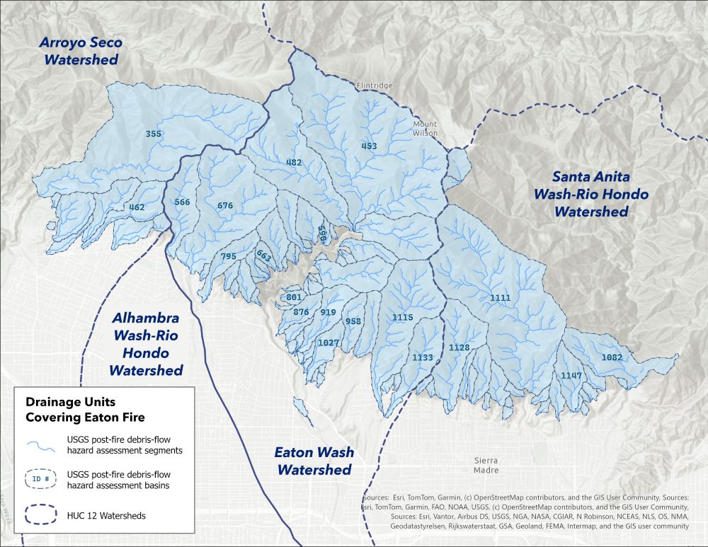
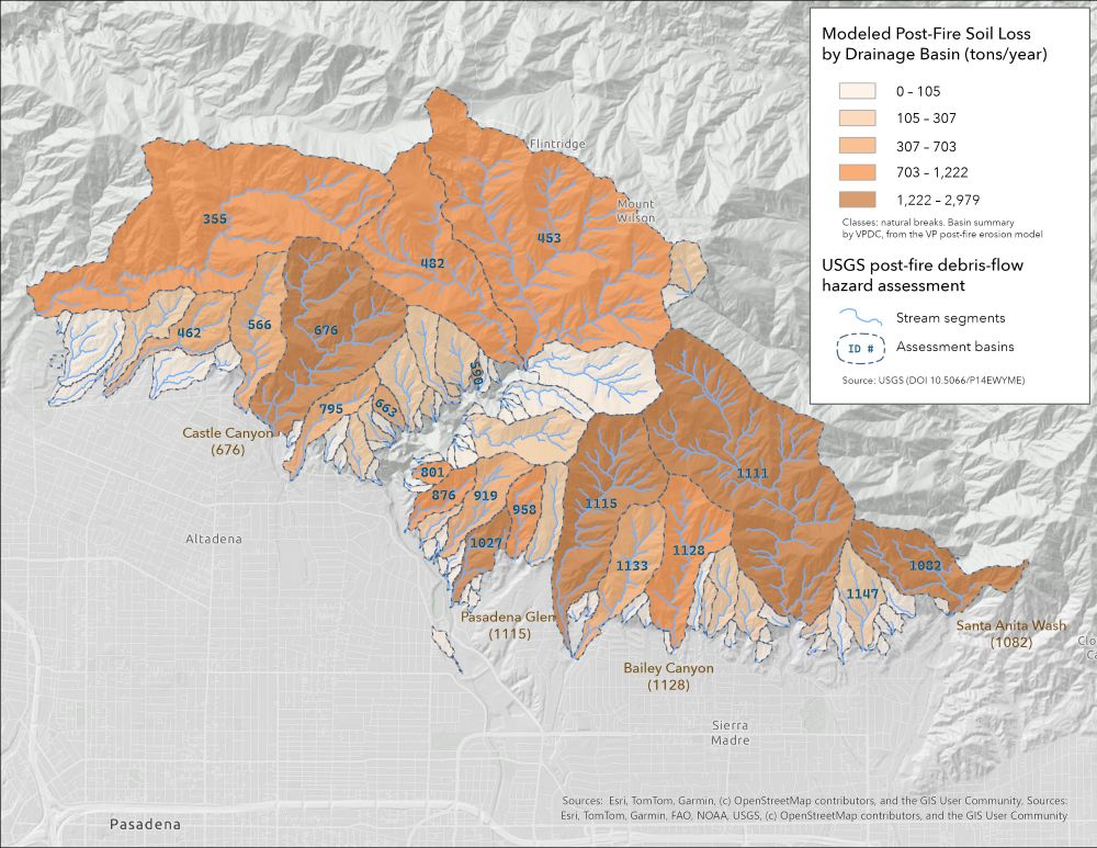
At this scale, the firewide total resolves into individual catchments that responders can weigh alongside other priorities. The largest single share sits in a small, steep catchment on the Santa Anita side of the burn (basin 1082), carrying roughly 3,000 tons per year of modeled post-fire soil loss from its burned area. Among the basins that follow, several are named front-country canyons — Castle Canyon (676), Pasadena Glen (1115), and Bailey Canyon (1128) among them — each draining toward the communities below. The 89 basins with modeled burn capture 91.9% of modeled acres and 89.8% of the firewide modeled increase; the remainder lies outside the debris-flow-modeled catchments.
Modeled erosion for top 20 USGS debris-flow hazard basin (burned area only)
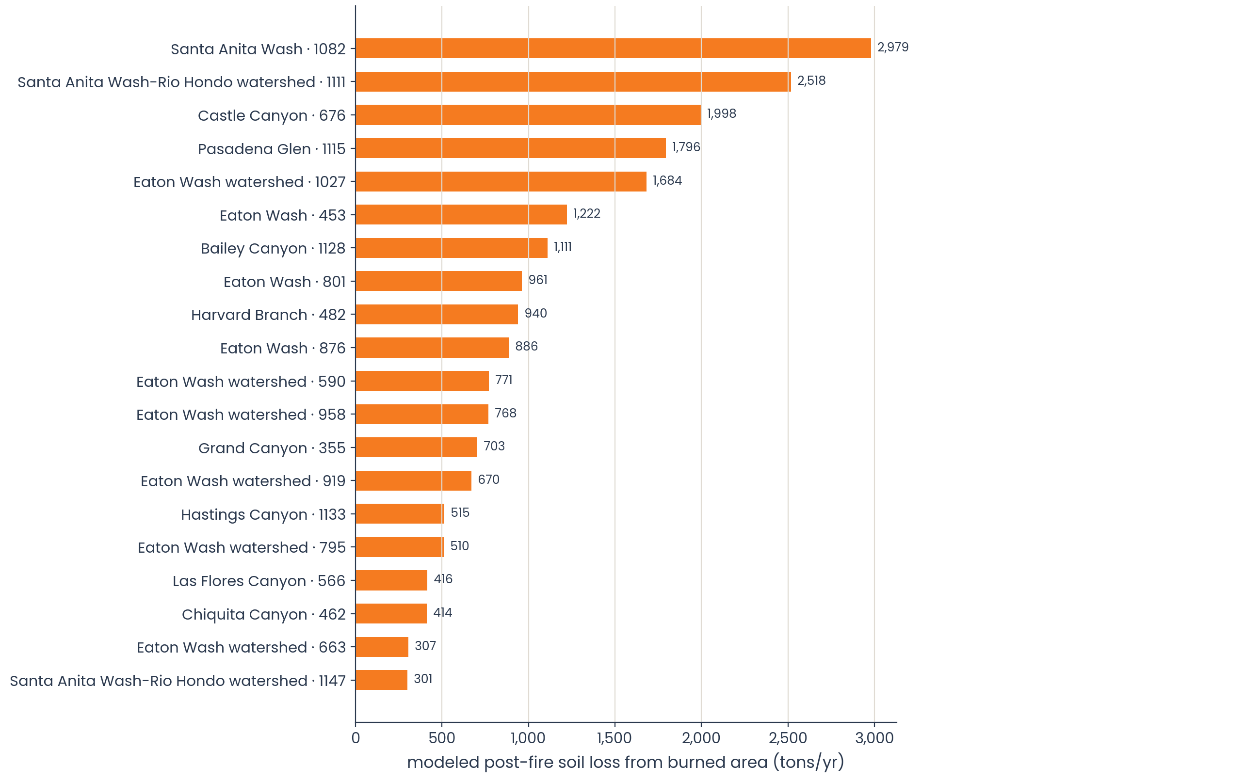
Modeled post-fire soil loss from the burned area for the largest 20 of the 89 basins with modeled burn; full table in the data package. Basins without a named canyon carry their watershed’s name. Burned-area contribution only; not whole-basin yield and not sediment delivered downstream. Basin geometry: USGS. Chart by VPDC.
Summarized this way, the erosion layer adds a quantity the existing basin data does not carry. The USGS assessment estimates the likelihood and potential volume of debris flows. This layer estimates how much hillslope soil the burned area above each basin is primed to shed. They answer different questions about the same catchments on the same boundaries, allowing teams to compare them without one replacing the other.
Connecting this source signal to downstream pathways and assets — including the catch basins whose capacity a season's load may strain — is the step past this layer, and it takes additional data and field knowledge.
That leads to the next question: not whether the erosion layer makes the call, but where it fits among the people, data, and workflows already responsible for making it.
Known Limitations
This layer is useful because it is specific. The limitations below define what it can and cannot tell users.
- Year-1 only.
The current output represents first-year post-fire effects. It does not model multi-year recovery or time-decay. - BAER-dependent.
The method requires a soil burn severity input. In this proof of concept, it builds from BAER/BARC severity information and inherits the timing, availability, and limitations of that input. - Not a debris-flow or flooding model.
The layer maps erosion-rate change. It does not model debris-flow probability, flooding, sediment delivery, infrastructure failure, or downstream hazard timing. - Not a treatment recommendation.
The output can help focus field verification and planning conversations, but it does not decide where treatments should occur or what treatments are appropriate. - No fire-year weather or general severity trends.
The demonstration does not account for the specific weather conditions of the fire year or broader severity trends. - Validation is partial.
The method has a remote-sensing observed-versus-predicted comparison for Eaton — which represents about half of the benchmarking a full validation would require — and leave-one-out cross-validation across the retrospective fires. Because the model uses one mean multiplier per severity class, that cross-validation figure reflects the spread of impacts more than a fully independent predictive test. It has not been benchmarked against field hillslope erosion plots, and that field benchmarking is out of scope for this proof of concept. - Severe-burn uncertainty is not propagated into the raster.
Class 4 has a high and variable multiplier: n=16, mean ≈ 9.9×, median ≈ 5×, range roughly 2× to 44×. The current post-fire erosion surface uses the mean multiplier by class; it does not carry that full range into each pixel. The raster therefore shows modeled magnitude, not statistical confidence. - Extent and resolution need to be stated clearly.
The current Eaton demonstration is processed across three Eaton-area HUC12s and interpreted within the modeled fire context. - Wind-stripping may matter for Eaton.
The BAER report notes that Santa Ana winds stripped topsoil and ash before rains, and BAER scientists expected less sediment delivery from severe areas than severity alone might imply. A severity-based multiplier could over-read some areas if antecedent wind or dry-ravel processes changed the available sediment before rainfall. - Difference from BAER erosion outputs.
Our model measures and predicts the increase in percent bare ground, then converts that to erosion rates using the Revised Universal Soil Loss Equation (RUSLE). That conversion relies on a separate model to compute the equation's cover factor. The cover-factor model used in this data product was developed in another region and has not been calibrated to local conditions. This affects the absolute magnitude of the erosion rates, but we expect the patterns and their interpretation to remain the same as calibration continues.
Where This Fits in Post-Fire Response
The Eaton analysis shows what the erosion layer can reveal. The next question is where that information belongs once a response is underway.
It belongs a step before the field-based hazard assessments some fires receive, like California's WERT (Watershed Emergency Response Teams). What it adds there is a translation of soil burn severity into an erosion-rate layer those later steps can build on.
Where this layer sits relative to a WERT assessment
When a California burn threatens downstream communities and other exposed assets, a Watershed Emergency Response Team (WERT) may be convened to assess post-fire hazards on non-federal lands. WERT assessments are field-based and incident-specific, focused on the downstream risk a burn poses to the people, infrastructure, and assets exposed below it.
This erosion layer sits one step upstream of that work. It translates soil burn severity into an erosion-rate layer a WERT or other assessment can use, question, or check against field conditions. It does not assess flooding or debris-flow hazard, and it does not link modeled erosion to specific downstream assets.
In plain terms: a WERT assesses post-fire hazard to exposed places. This layer maps one contributing signal — where burned hillslopes are expected to shed more soil.
Producing a good layer is only part of the problem; it has to reach the people making decisions. At Eaton, information moved across many agencies through reports, maps, task-force meetings, and field observations. A new layer is only useful if it can travel those same routes. This one is built to be a tributary to that system: it starts from information post-fire teams already use and moves through the same channels:
soil burn severity → erosion-rate layer → data package and viewer → reports, maps, and summaries → coordination and field decisions
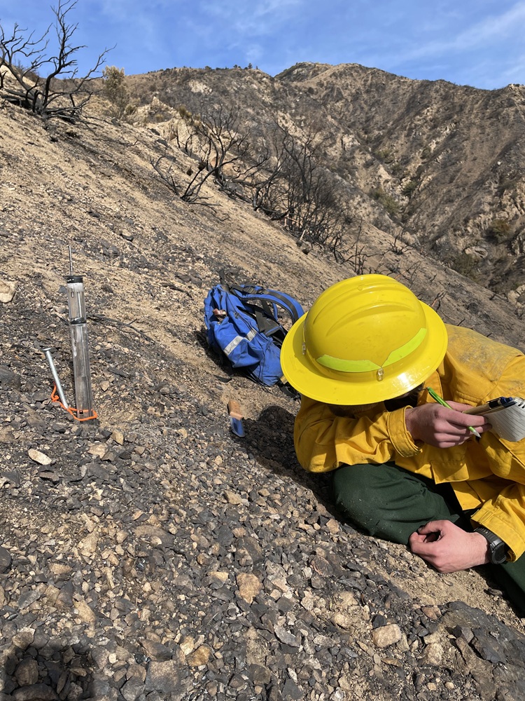
Measuring post-fire soil conditions. A scientist uses an infiltrometer to assess how water moves into burned soil within the Eaton Fire burn area. Photo: U.S. Geological Survey Landslide Hazards Program.
The layer is only one input among many. Response partners still need terrain, rainfall forecasts, debris-flow and flood information, infrastructure, field observations, treatment feasibility, jurisdictional authority, and values at risk. It isn't meant to replace BAER, WERT, NRCS, local teams, or field judgment. What it offers is a clearer, more consistent erosion starting point: one that feeds existing workflows, helps target field verification, and travels across agencies and audiences.
The aim is to ease the technical and data-preparation load where that's feasible, so teams spend more of their limited time keeping information current and getting dollars and treatments where they're needed before the next storm. First-year erosion is one worked example of how a science workflow can become a usable, shareable layer — a pattern other layers could eventually follow.
That is why the prototype is built as a data package rather than a single static map. A map can show the signal. A package helps it travel: map layers for exploration, downloadable rasters and summaries for technical users, plain-language limitations for decision-makers, and a lightweight viewer for coordination. In time, these could connect to the systems partners already work in.
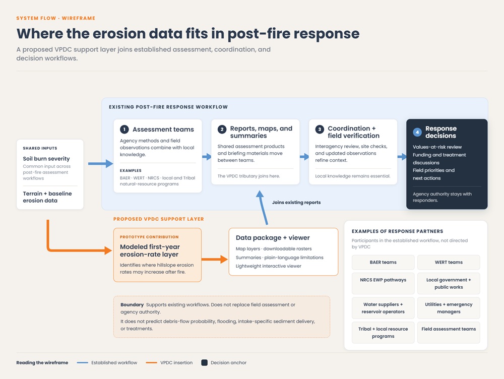
A tributary to the existing workflow. The proposed VPDC support layer (orange) enters the established post-fire response (blue) at the reports-and-summaries stage, starting from the soil burn severity input responders already share. Decisions and agency authority stay downstream, with the teams who hold them. Wireframe by VPDC; structural draft.
How the Layer Can Support Decisions
Wherever it travels, the layer plays the same supporting role. It doesn't make the call — field verification, values-at-risk determinations, treatment prescriptions, and funding requests all stay with the responders who hold them. What it does is help organize attention. After a fire, partners have to turn fast-moving information into practical choices: where to send crews, where to check model outputs against field conditions, where sediment problems may deserve review, and where limited mitigation or monitoring capacity should go. The layer gives them a shared, wall-to-wall starting point for first-year erosion-rate change, one baseline every partner can inspect, summarize, and discuss from.
The package offers two surfaces, and they answer two different questions for two kinds of users.
The change surface shows where the fire produced the largest increase over baseline — the natural starting point for where field crews look first. For BAER and NRCS-equivalent responders, the strongest candidates for verification are areas of high modeled increase, high-severity burn, or wide class-level uncertainty — especially where they overlap steep terrain, channels, roads, intakes, or homes.
The post-fire surface shows where the strongest modeled hillslope source areas now sit — the starting point for where mitigation, monitoring, or planning should focus. For water suppliers and reservoir operators, it's a first cut at sediment planning: where modeled erosion overlaps the assets and values they're responsible for. It points to where to look harder, not what treatment to apply.
Across both, uncertainty is meant to be used, not hidden. A single number for a severely burned area can look more certain than it is; showing the range behind each severity-class multiplier lets users see where the model gives a strong signal and where a result deserves extra scrutiny. Uncertainty isn't a reason to ignore the layer — it's a guide to where field verification matters most.
That suggests a decision lens less about "high confidence" than about modeled magnitude plus need for scrutiny:
- lower modeled increase: maintain awareness;
- high modeled increase with relatively tighter class-level spread: consider for planning review;
- high modeled increase with wider class-level spread: prioritize field verification;
- high modeled increase plus known values at risk: evaluate for treatment, monitoring, or coordination.
This is one way the data could be used, proposed here as a scaffold rather than an established response framework. It's meant to map onto the real BAER and post-fire coordination workflow.
Explore the Eaton prototype
The prototype below brings the Eaton data layers and basin summaries together in an interactive view. Switch between modeled layers, select a basin to explore its summary, and compare patterns across the burn. For a larger view, open the full tool in a new browser tab.
looking ahead
The Eaton package is both a demonstration and a foundation. It shows how one post-fire science workflow can become a public-benefit data package: documented layers, maps, plain-language summaries, a viewer anyone can explore, and clear limits that travel with the data. The next challenge is to iterate on the science and streamline delivery.
Strengthening the evidence is the clearest next step. Ongoing work to compare modeled erosion rates against field measurements at hillslope and watershed scales will sharpen the model fire after fire, making each estimate of past-fire impact and each new prediction more defensible for the people who rely on it in the field. It's the kind of refinement that compounds: every fire studied makes the next prediction better.
The same retrospective record highlighting how elevated erosion rates ease with landscape recovery also affords additional opportunities — showing communities not just where risk rises, but how long it lingers. Future versions can carry the full range behind each estimate, so users see where the modeled signal is strong and where the spread is wide enough that field review matters most. And the delivery can keep maturing alongside the science, so rigorous, event-specific work becomes easier to produce, explain, and share inside the workflows partners already use.
The real deliverable behind the Eaton demonstration is not a single map, but a repeatable path from science to usable, shareable data: learn from each fire, improve the science, improve the package, and keep testing which formats actually help under deadline. Eaton is one worked example of that path.
No single agency, discipline, or organization holds the whole answer to what follows a fire. Meeting the challenge takes federal, state, local, and tribal partners, public-benefit and nonprofit science, and researchers and responders alike: bringing the best available science together, sharpening it as they learn, and working to get it into the hands of the people who have to act under a tight post-fire clock. The next version should be stronger for it — tested against the ground, against user needs, and against the realities of post-fire response.
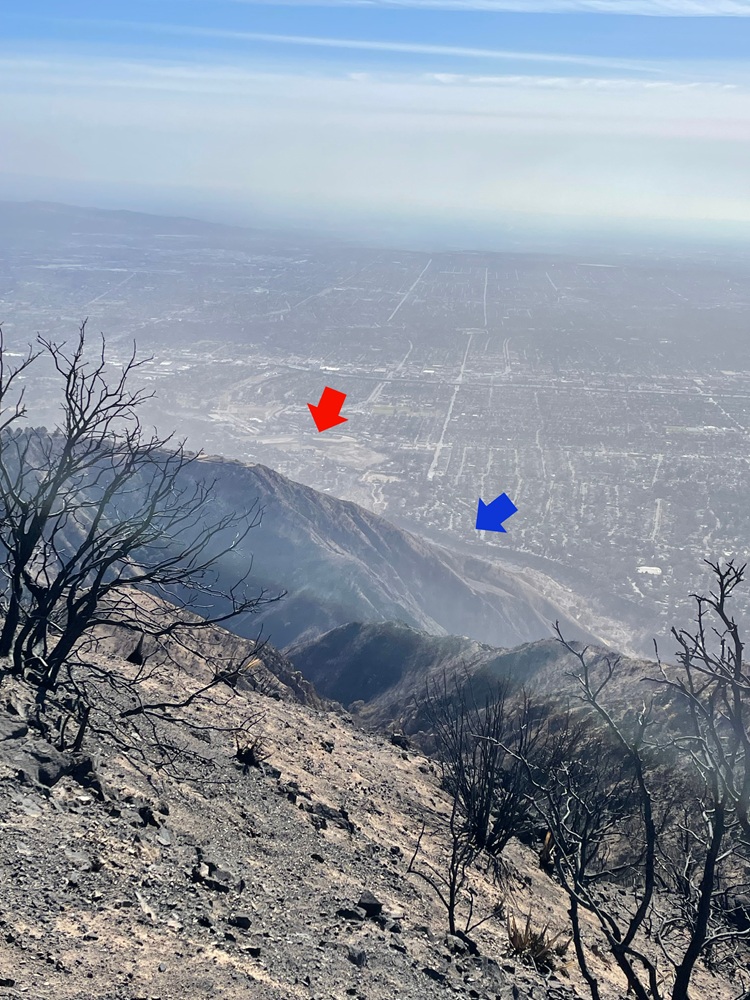
Eaton Wash (blue arrow) flows along the mountain front into Eaton Wash Reservoir (red arrow), seen from Muir Peak within the Eaton Fire burn area shortly after containment. The dam and reservoir help control flood waters and trap sediment shed from the range front during the rainy season, mitigating debris-flow hazards after wildfire. Photo: U.S. Geological Survey, Landslide Hazards Program, January 20, 2025.
We want to hear from you
This prototype is intended to test what kinds of post-disaster data packages, visualizations, and tools would be useful to response partners, water and infrastructure managers, local governments, community-serving agencies, and the open-science community
Attribution: Method design, erosion model development, and model outputs by Dr. Joe Shannon, Lead Scientist, Applied Hydrology, Vibrant Planet, with data acquisition and preparation by Kirk Evans, Spatial Analyst, Vibrant Planet. Project conceptualization and management by Dr. Chelsey Walden-Schreiner, Director of Science Development, Vibrant Planet Data Commons. Story, Eaton Fire analysis and summary statistics, cartography, data visualization, and prototype design and development by Alister A. Fenix, Director of Geospatial Storytelling & Development, Vibrant Planet Data Commons. Funded by the Cisco Foundation.